2013 Christmas Cards…
I made something similar to this last year, although I couldn’t find whether I posted about it on my blog to re-share with you! Such a great way to organize the cards as the arrive in the mail!
You can simply put a hole punch in the corner and just use a ribbon if you don’t want to go to all this trouble, but I think its kinda fun to fill my day up with crafting!
First I glued paper to cardstock paper…
Deciding how to label the front of the card holder is the greatest part of all – I started doing this at the end of my crafting day, so I kept mine simple this year. I just hand stamped “Christmas 2013”.
& glued it to an old dollar frame I have from Michaels.
I then began to paint the outside of the paper with acrylic paint…I recently did a similar project of layering paint for a storage box to go into my daughters room ~ for some reason, I am loving the layered paint look!
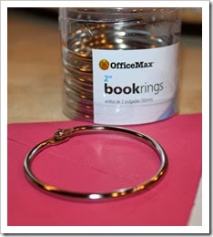
Using a hole punch and looping the book ring thru with your holiday cards in the center creates a darling 2013 Christmas card holder and piece of décor for your home!
Keeping the hole punch near to add more cards as they arrive in the mail box makes keeping up with this project super easy!
Everyone loves being able to flip through all the cards throughout the season! Let me know if you do something similar, I would love to see! To see where else I am linking to this week – please check my “Cottage Links” label…xoxo, tracie
PS – Follow Fishtail Cottage on Facebook / Pinterest / Twitter


Comments
Happy Holidays!!
XO,
Jane
Karen